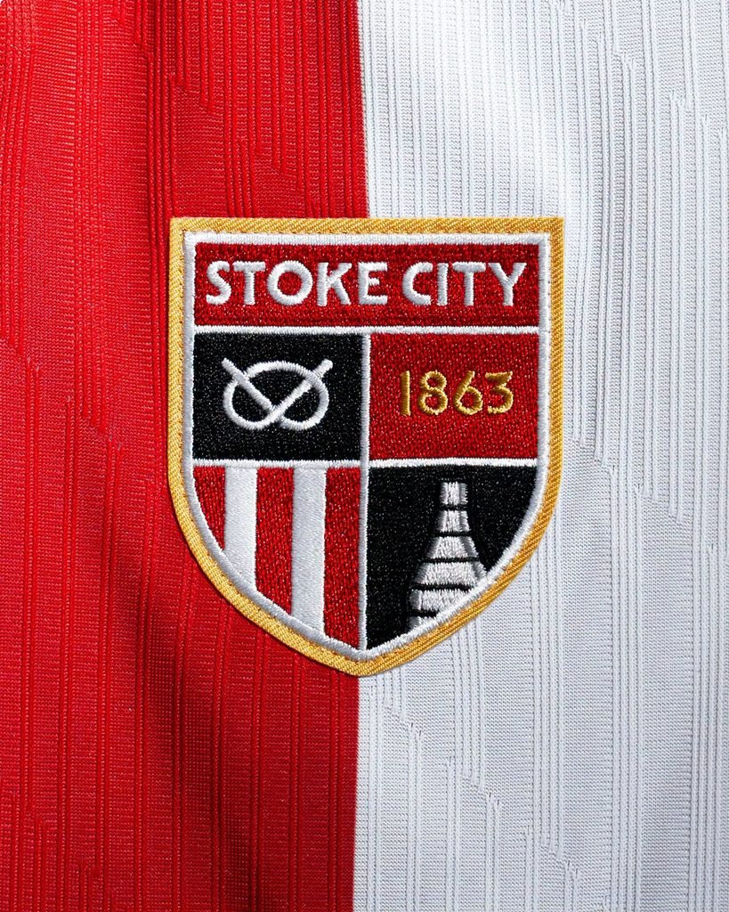
The first thing you notice about the Stoke City 2026/27 home kit isn’t the fabric or the collar. It is the crest. By retiring the corporate shield they have worn since 2001, the club immediately changes the entire feel of the kit. It no longer looks like a modern brand template. It looks like a football club again.
The Return of the Roundel
The new Stoke City badge is a modernised version of the roundel worn by the club between 1977 and 1992. That era, stretching from Tony Waddington to Richie Barker, established the classic Stoke aesthetic for television audiences.
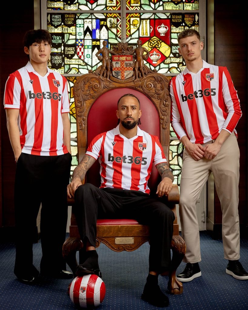
The 2001 shield flattened that identity into a clean, easily reproducible graphic. Bringing the 1970s roundel back works because it puts the city’s history back at the centre of the garment.
Correcting the Stripes
That historical reset required the rest of the kit to get back in line. Last season, the club experimented with fan-designed wavy stripes, a polarising disruption of their traditional geometry.
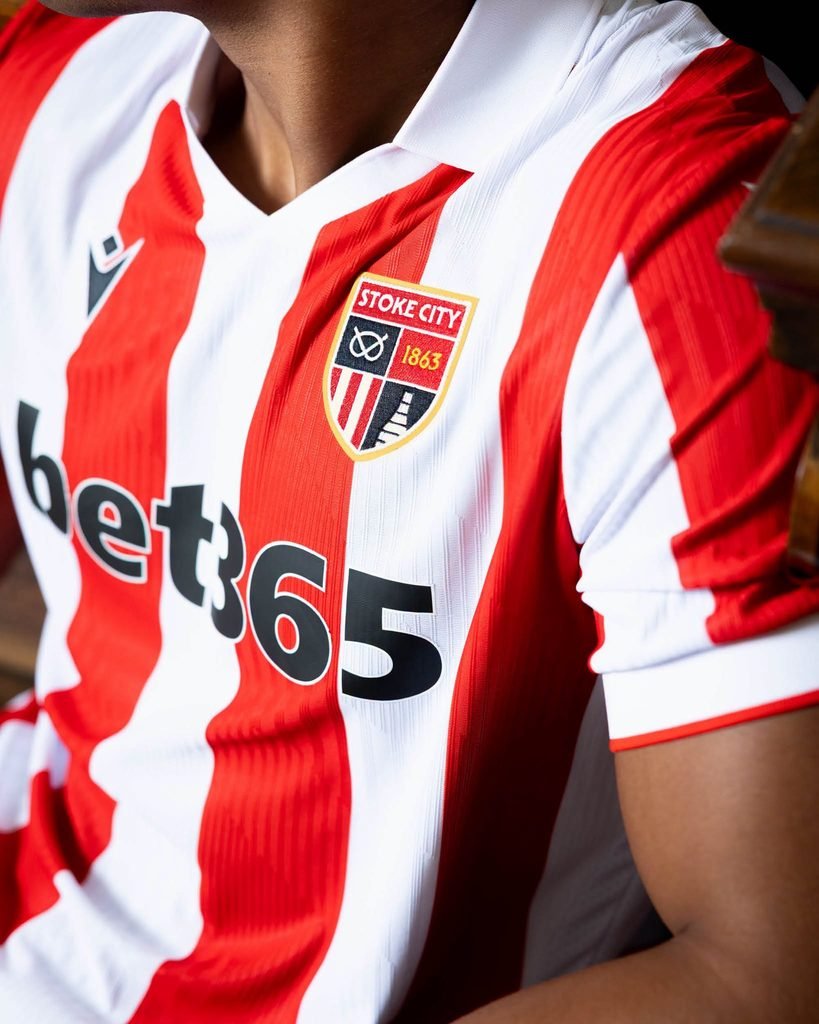
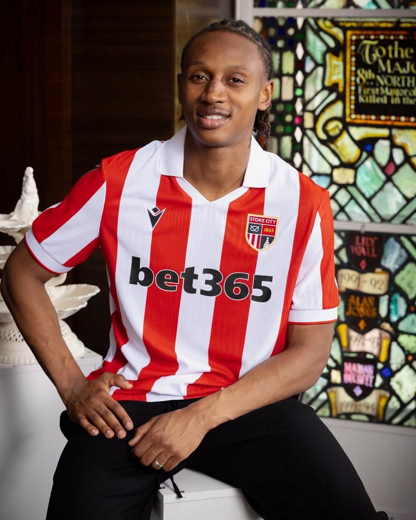
For 2026/27, the red and white columns return to rigid, plumb-line verticals. When you reinstate a classic heritage crest, you cannot sit it on top of a digital distortion. The stripes had to be straight.
The Kiln at the Centre
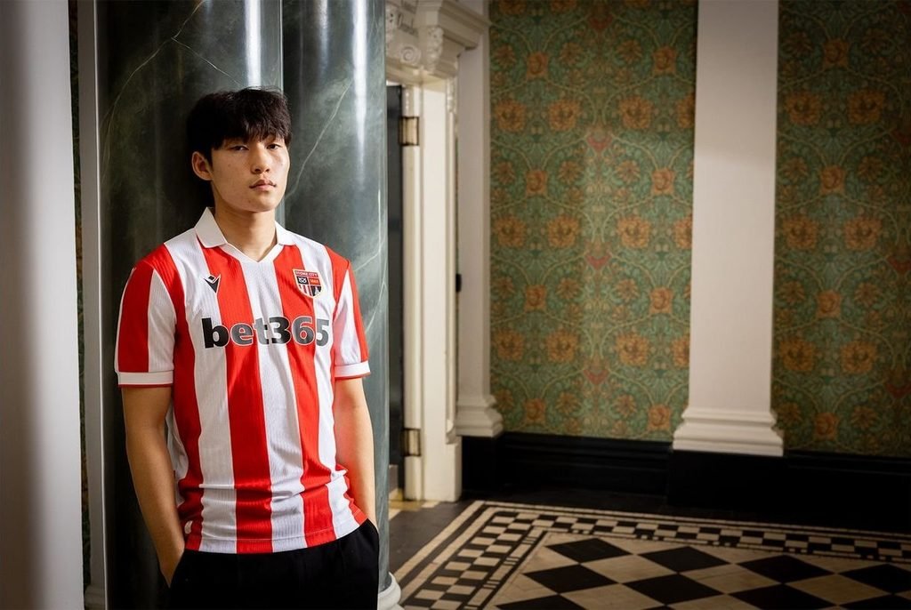
The deeper story sits inside the crest itself. The top half of the roundel features the silhouette of a bottle kiln.
Decades ago, thousands of these brick ovens dominated the skyline of Stoke-on-Trent, powering the region’s pottery industry. Today, fewer than fifty survive. Reinstating the kiln, alongside the Stafford Knot and the 1863 foundation year, does more than just nod to nostalgia. It explicitly reconnects the club to the working-class history of North Staffordshire.
Modern Construction
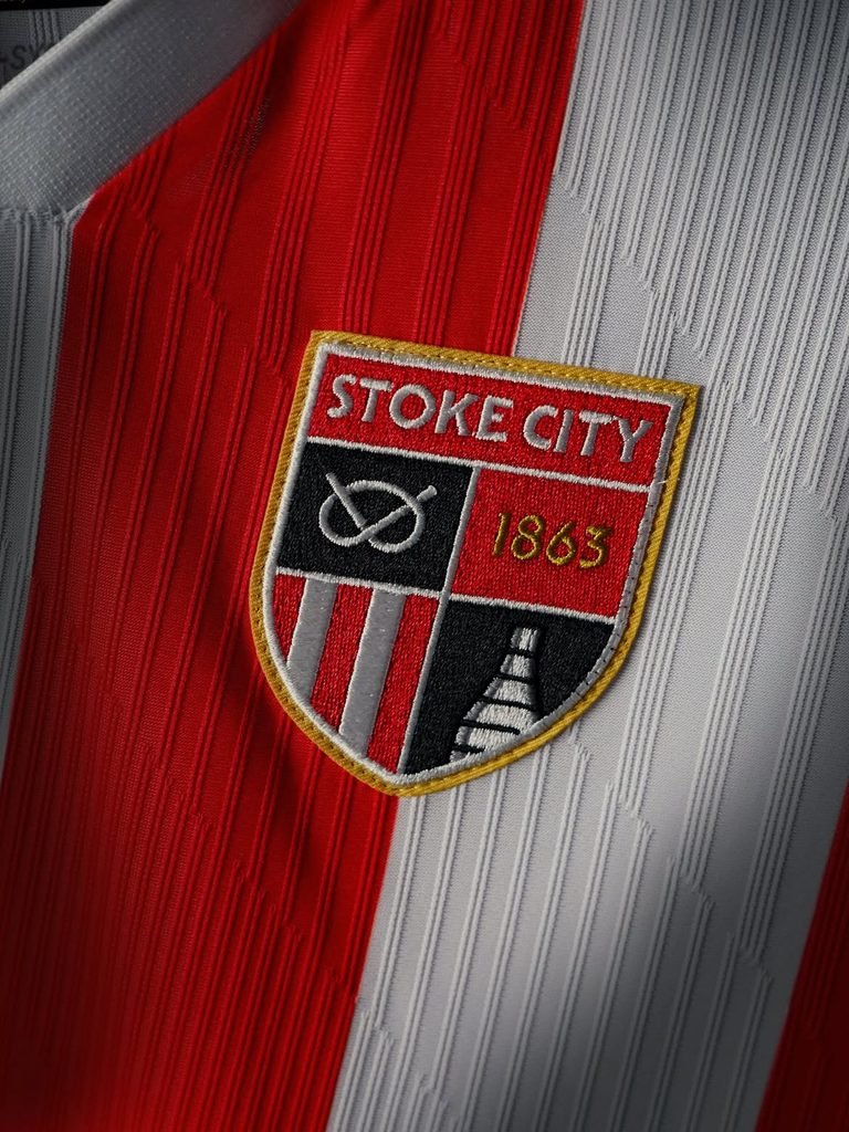
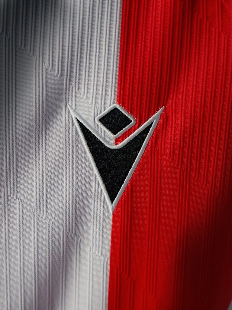
But Macron hasn’t just produced a literal 1970s replica. They modernised the construction while keeping the visual language traditional.
The Stoke City 2026/27 home kit is cut from Eco 3D Knit Jacquard, a 100% recycled polyester yarn. Instead of printing artificial shadows or patterns over the stripes, a geometric texture is woven directly into the fabric. The technology sits in the tactile weight of the material, not the graphic design.
Editorial Restraint
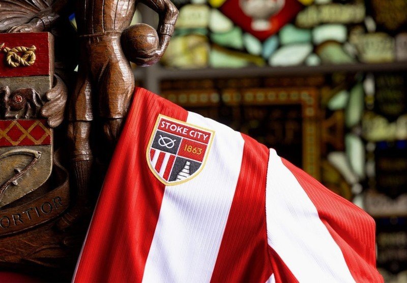
This is where the ten-year partnership between Stoke City and Macron shows its value. A less experienced manufacturer might have tried to add contrasting sleeves, busy collars, or modern side panels to justify the new release.
Macron exercised restraint. A flat-knit white polo collar and solid white cuffs trimmed with a single red line provide just enough structure. They didn’t need to compete with the restored identity; they just let it do the heavy lifting.
Looking Like Stoke
On the back of the neck, the municipal motto VIS UNITA FORTIOR (“United strength is stronger”) is printed in black.
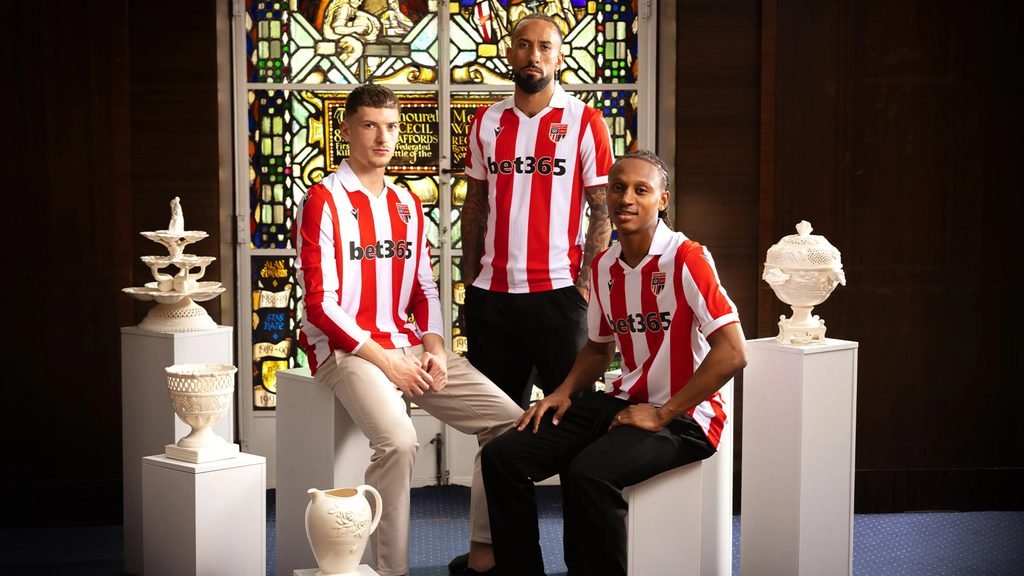
It is a quiet final detail on a kit that understands its brief. The Stoke City 2026/27 home kit doesn’t try to reinvent the club for a new commercial era. It just makes them look like Stoke City again.