Some football shirts try to command attention through louder graphics, busier patterns and ever-changing design trends. Others understand that identity doesn’t need to compete for attention. First AC Monza 2026/27 home kit and away kits under Nike belong firmly in the second category, embracing restraint at a moment when simplicity has become one of the hardest ideas to execute in football design.
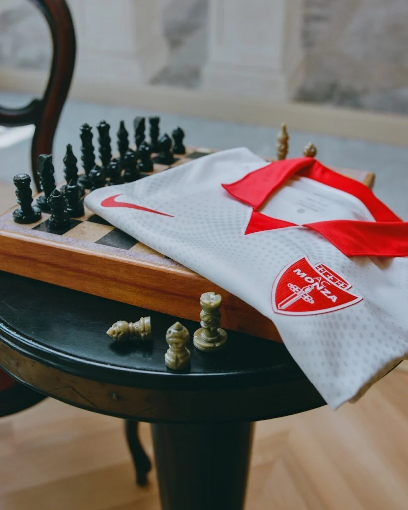
More than the start of a new season, these shirts introduce the beginning of a new partnership. Nike arrives as Monza’s technical partner for AC Monza with a philosophy that feels less interested in reinvention than refinement. Rather than rewriting the club’s visual identity, the American sportswear giant has chosen to sharpen it. It’s a bold decision precisely because it refuses to be one.
What’s New?
The headline isn’t an elaborate graphic or a radical colour palette. It’s the arrival of Nike and a deliberate return to the visual language that has defined AC Monza 2026/27 home kit & away kit for generations.
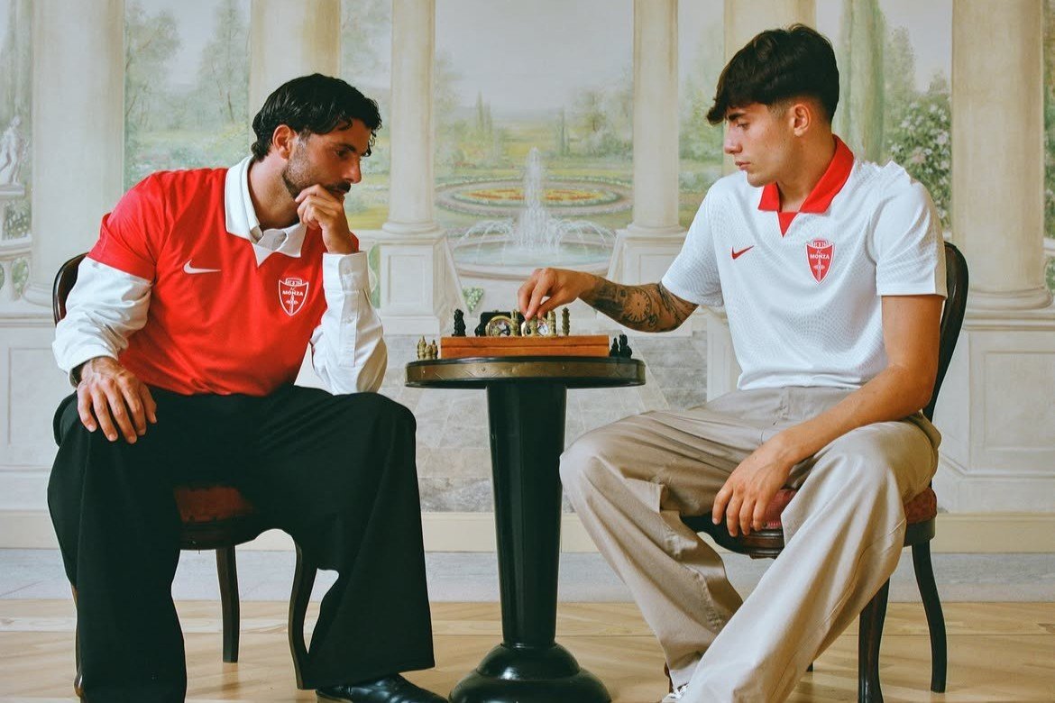
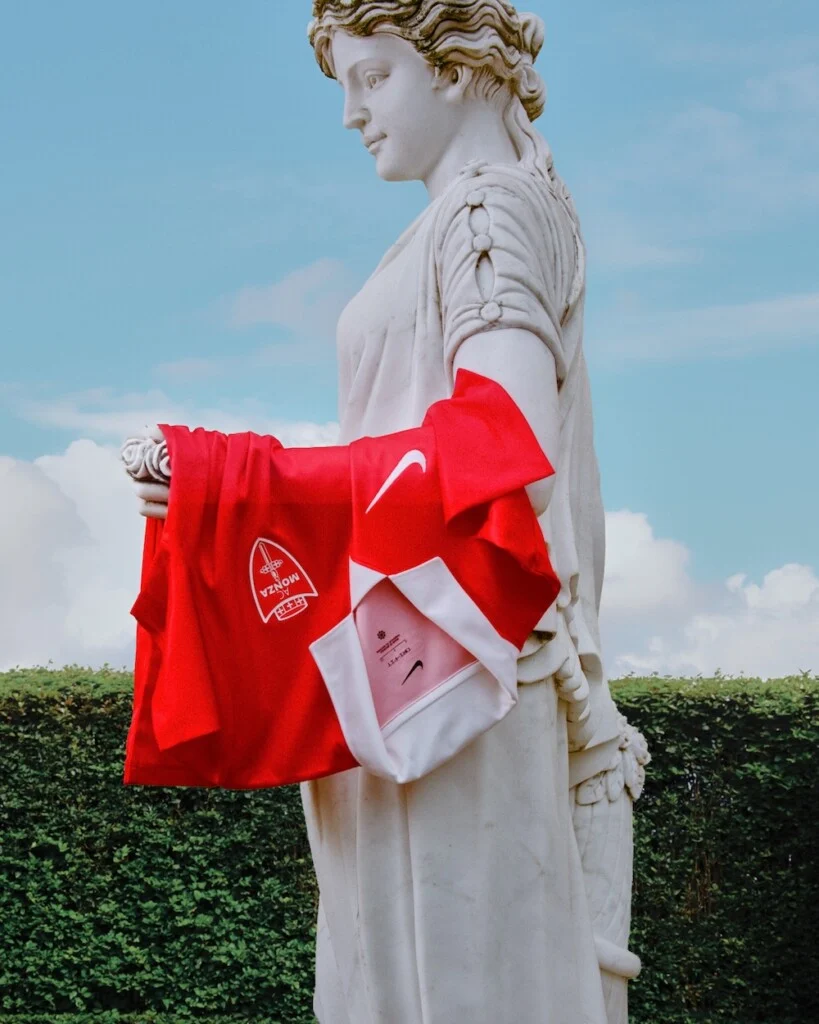
The home shirt remains almost entirely Monza red, uninterrupted across the body. The only contrast comes from a crisp white collar that immediately recalls football’s most timeless silhouettes. Meanwhile, the away shirt reverses the formula with a clean white base complemented by Monza red accents, creating a pairing that feels familiar without looking dated. Together, they signal a new era without pretending the club’s history began yesterday.
Reading the Shirt
Look beyond the colours and the design starts speaking a different language. The uninterrupted red of the home shirt isn’t simply a stylistic choice. By avoiding unnecessary graphics or tonal overlays, Nike allows Monza’s defining colour to carry the entire identity of the jersey. Confidence replaces decoration.
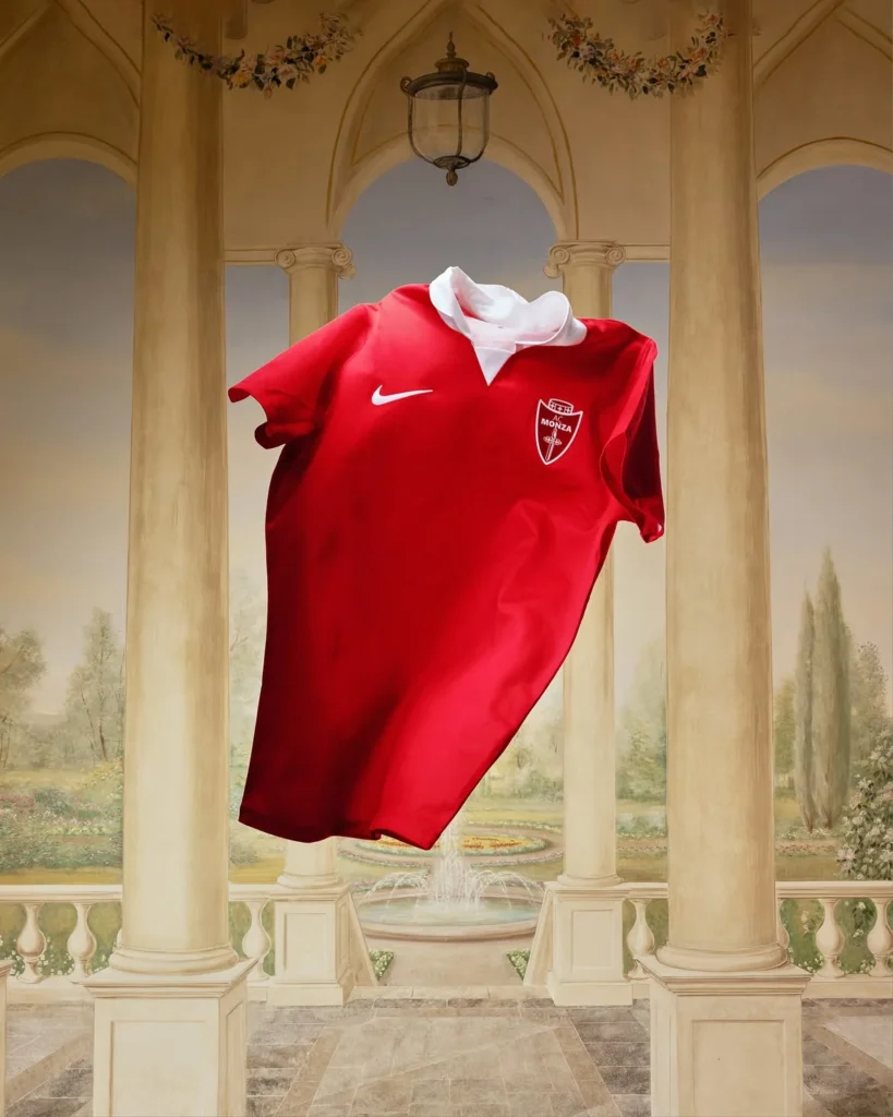
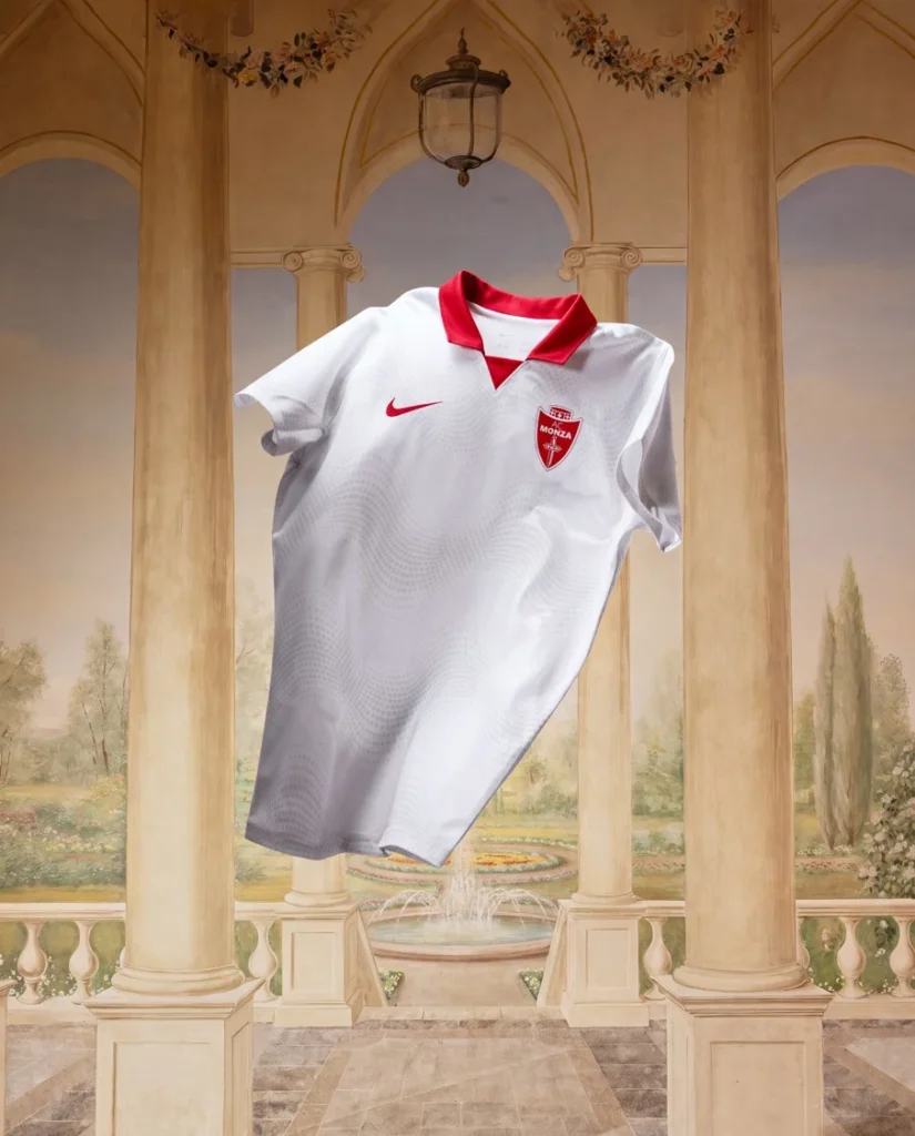
Then there’s the white collar. It’s a small detail, but arguably the most important one. Football’s greatest shirts have often relied on collars not as fashion accessories but as visual anchors. Here, the collar frames the jersey, softening the intensity of the red while quietly reconnecting Monza with the classic aesthetics that continue to influence modern football culture.
The away shirt follows the same philosophy. Its white foundation allows the Monza red detailing to become the focal point, creating movement without relying on aggressive visual effects. Rather than competing with the club’s identity, the design gives it room to breathe. That’s where things become interesting. Neither shirt attempts to dominate the conversation. Instead, both trust Monza’s identity to do the work.
Design Inspiration
According to the club, both kits are rooted in the visual traditions that have shaped AC Monza across decades. Rather than chasing contemporary trends, Nike has leaned into the enduring codes of Italian football. That approach reflects more than nostalgia. It acknowledges that some identities don’t need rebuilding, they simply need reaffirming.
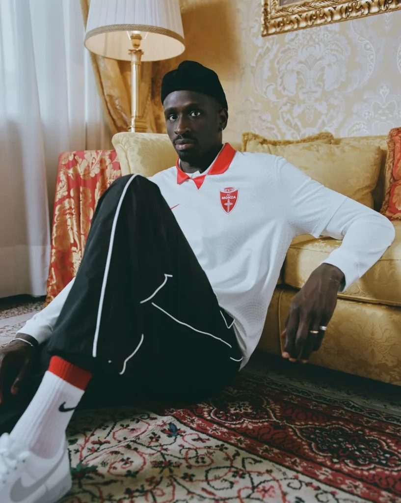
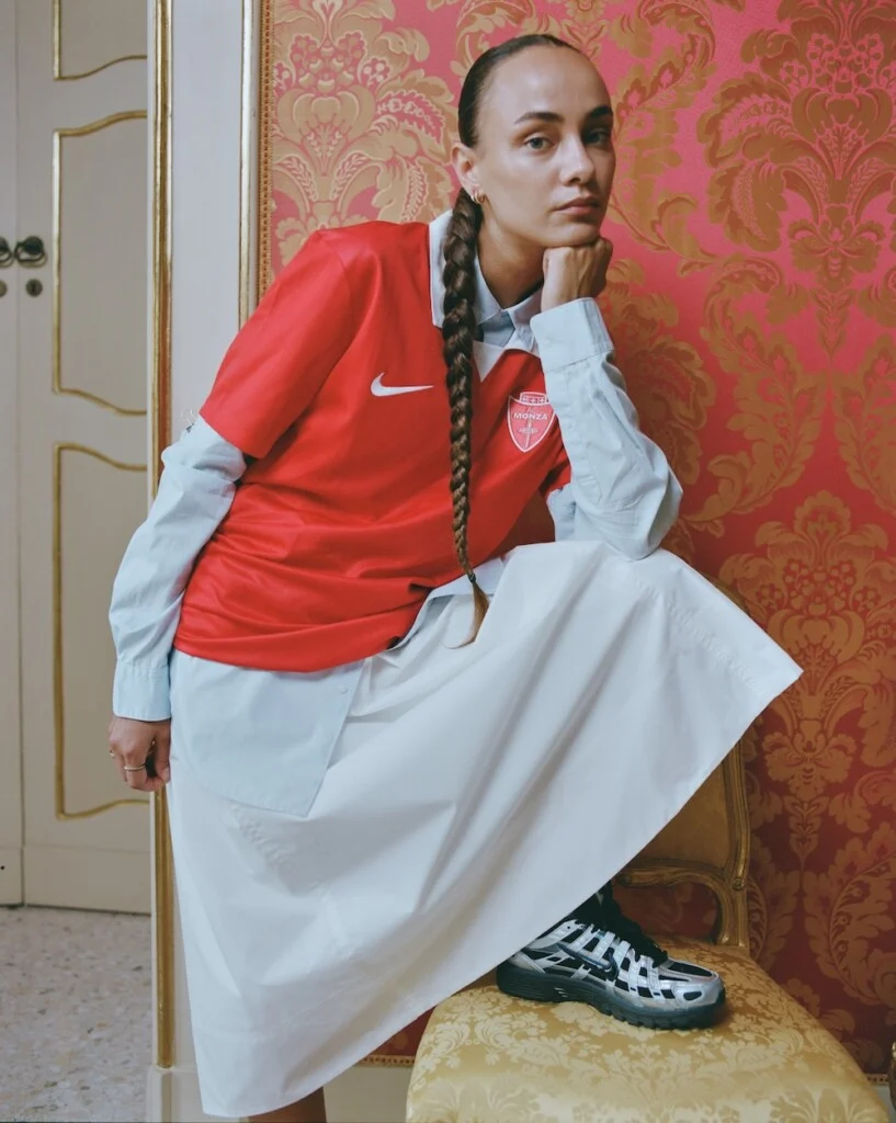
The launch campaign reinforces that idea by placing the shirts among Monza and Brianza’s most recognizable landmarks. The city isn’t treated as a backdrop for promotional photography but as part of the narrative itself. Clubs, supporters and places become inseparable, reminding viewers that football shirts often represent communities long before they become products. History isn’t being recreated here. It’s being carried forward.
More Than a Sponsor
Nike’s arrival marks one of the most significant commercial moments in Monza’s recent history. For a club continuing to establish itself within modern Italian football, partnering with one of the world’s biggest sportswear brands sends a clear message about ambition. Yet the collaboration avoids the temptation to announce itself through an overly experimental debut collection.
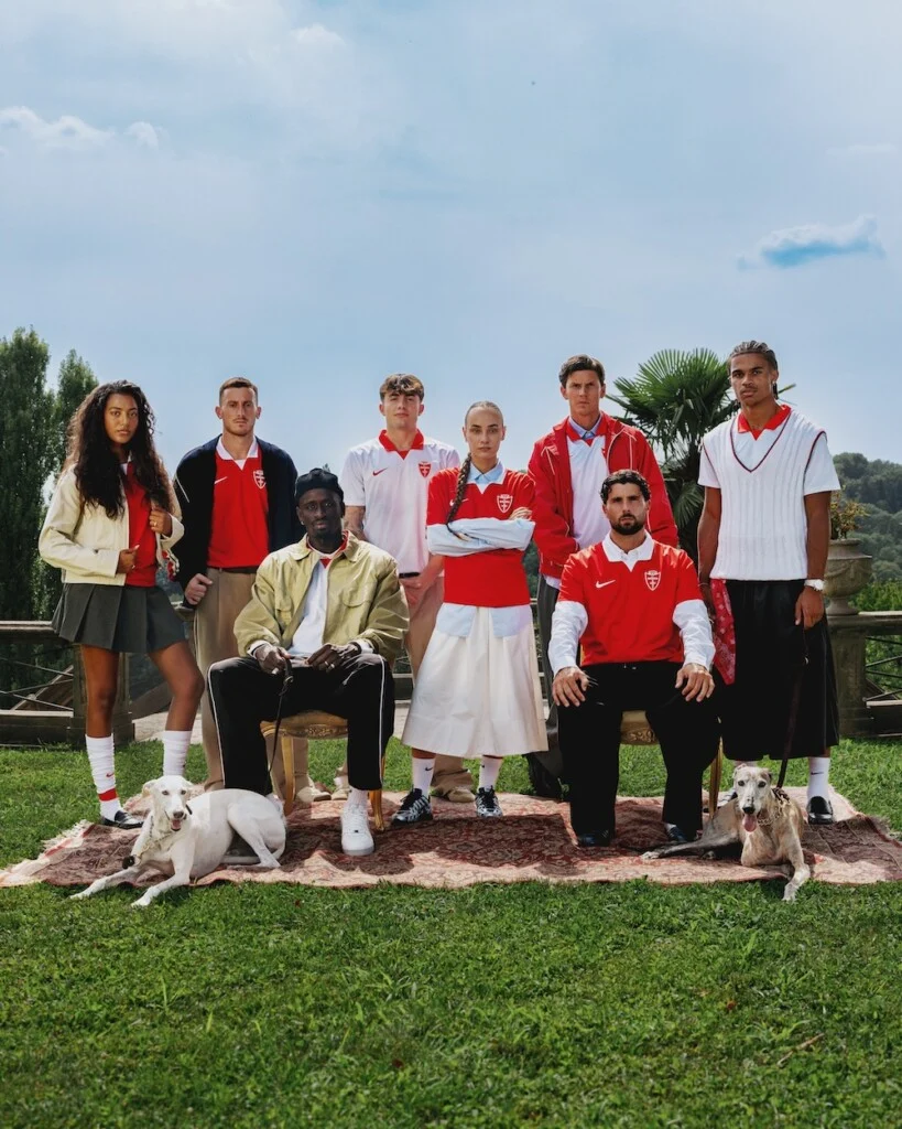
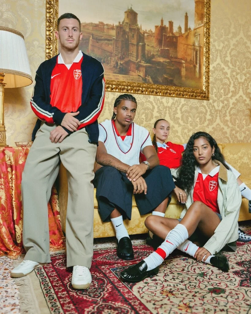
Instead, Nike’s first impression is remarkably restrained. That strategy makes sense. Global manufacturers often face a delicate balancing act when joining a new club. Push too far, and supporters question whether tradition has been sacrificed. Play too safe, and the partnership risks feeling anonymous.
Monza’s first Nike collection finds a thoughtful middle ground. It introduces a globally recognized design philosophy while allowing the club’s own identity to remain the protagonist.
Football Meets Fashion
Minimalism has become one of fashion’s defining languages over the past decade. From luxury houses to Scandinavian lifestyle brands, the idea that less can communicate more has steadily influenced contemporary design. Football shirts haven’t always followed that trend.
Recent seasons have often produced increasingly complex graphics, oversized textures and layered storytelling that sometimes disappears from a distance. Monza’s new kits resist that direction entirely.
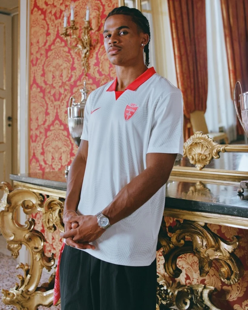
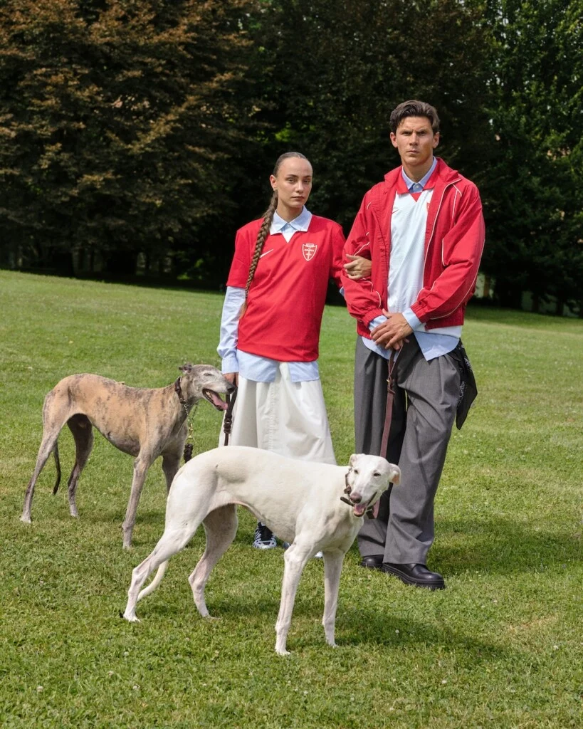
The home shirt, in particular, feels designed for life beyond matchday. Its uninterrupted red surface and understated detailing make it as comfortable beneath a jacket or overshirt as it is inside the stadium. That’s increasingly important in a world where football shirts have become everyday wardrobe pieces rather than garments reserved exclusively for ninety minutes. This collection understands that supporters no longer wear football shirts only to football. They wear them everywhere.
Release Information
The away kit will make its on-pitch debut on 24 July 2026 when AC Monza faces Galatasaray in a pre-season friendly. Both the home and away shirts will be available from 22 August through GTZ channels and selected authorized retailers.
Who Will Appreciate It?
Supporters looking for a shirt that faithfully represents Monza’s traditional identity will find plenty to appreciate here. The designs don’t rely on gimmicks that may feel dated within a season or two. Collectors may also recognize the significance of this release. As Nike’s first official home and away collection for AC Monza, these shirts mark the beginning of a new chapter in the club’s visual history.
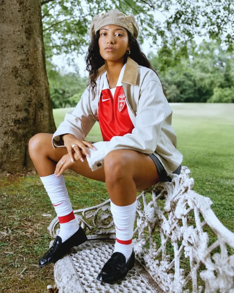
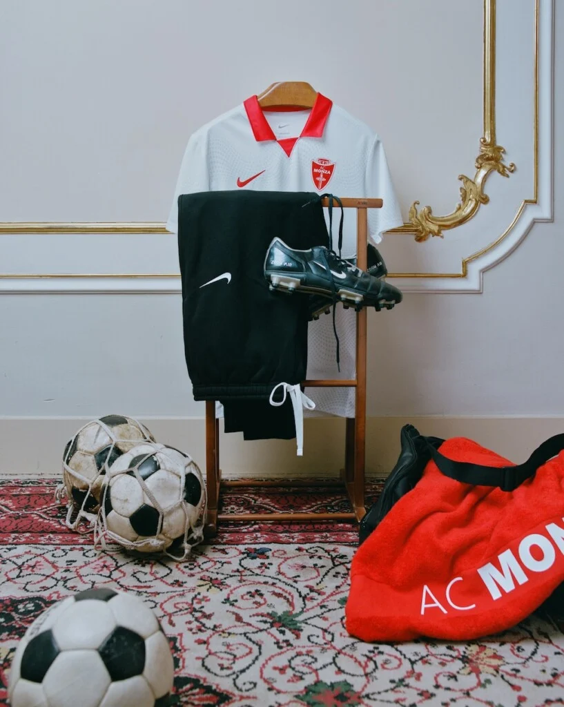
For football fashion enthusiasts, the home shirt stands out as the stronger option. Its clean silhouette and classic collar make it one of those rare football jerseys capable of crossing comfortably into everyday style.
Does It Respect Club Identity?
Everything about these shirts suggests that Nike understood its first assignment. Rather than asking how dramatically Monza could change, the better question became how confidently the club could remain itself. The answer is refreshingly understated.
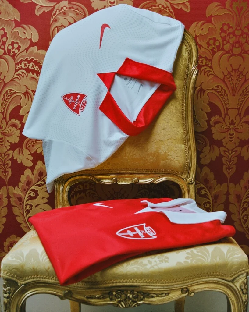
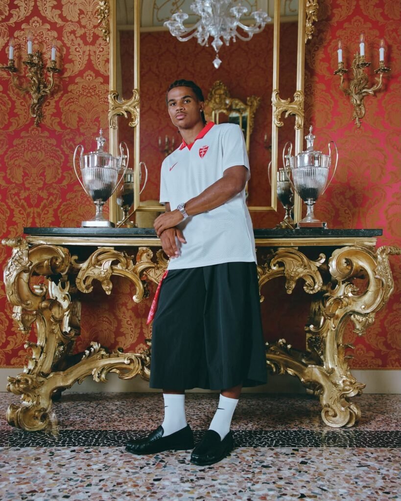
The uninterrupted red, the restrained detailing and the classic collar all reinforce a visual identity supporters already recognize. The away shirt complements that philosophy without becoming a mere inversion of the home design, giving both jerseys their own personalities while maintaining a shared foundation. Will these become the most revolutionary football shirts of the season? Probably not. But that was never the objective. Instead, they demonstrate that respecting tradition doesn’t have to mean repeating the past. Sometimes evolution is measured not by how much changes, but by understanding exactly what should stay the same.
Final Thoughts
AC Monza’s first Nike collection succeeds because it understands a simple truth often forgotten in modern football design: identity isn’t created by adding more. It’s created by knowing what deserves to remain. In an era where many clubs chase novelty for its own sake, Monza and Nike have chosen clarity instead. The result is a pair of shirts that feel unmistakably contemporary while remaining deeply connected to the club’s heritage, its supporters and the city it represents. Sometimes the boldest statement is simply refusing to shout.