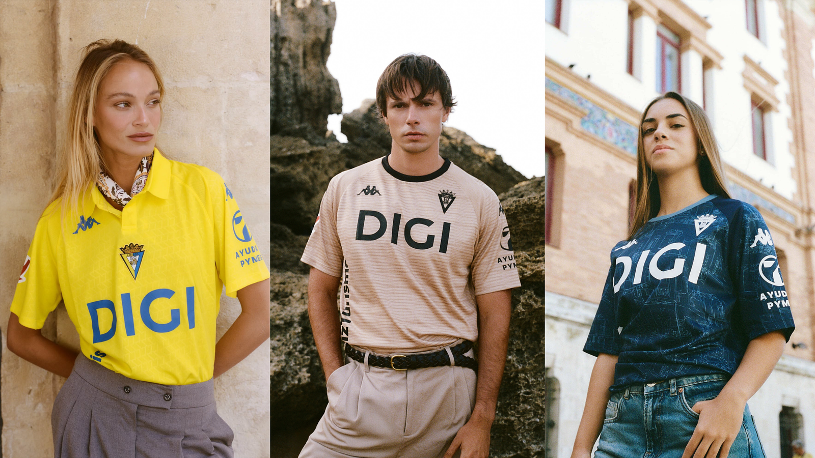
Kappa delivered a beautifully restrained, retro-inspired home shirt. But as the massive front-of-shirt sponsor proves, minimalist design is a luxury only football’s elite can afford.
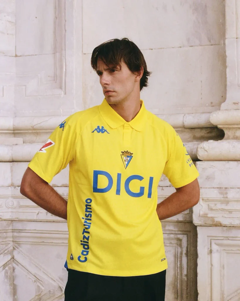
If you look exclusively at the collar and shoulders of the new Home Cádiz 2026/27 Kits, you can see exactly what Kappa intended to do.
Working from a plain yellow base, the designers added a classic polo collar with royal blue trim and ran the familiar ‘Omini’ banda down the sleeves. Stripped of context, it is the purest expression of a traditional football shirt, one that relies entirely on cut, colour, and restraint.
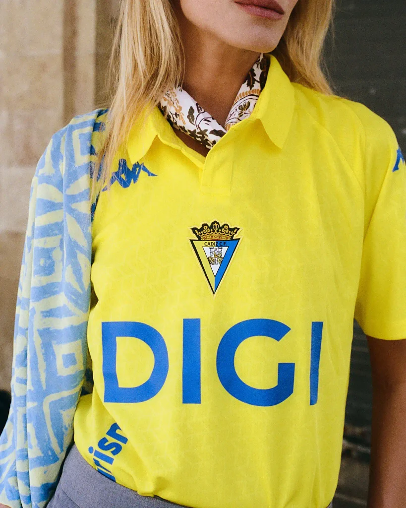
But a canvas only stays clean if you don’t have to sell the space.
The Shift from Utility to Culture
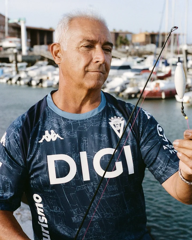
To understand what Kappa is attempting in Andalusia this season, look at what they replaced. For several years, Cádiz wore Macron. The Italian brand provided reliable, functional teamwear. The kits looked like standard modern football equipment.
Kappa’s arrival for the Cádiz 2026/27 Kits season signals a deliberate pivot away from utility and toward culture. The brand brings an inherent 1990s nostalgia alongside a specific streetwear credibility, treating Cádiz’s wardrobe as a lifestyle project.
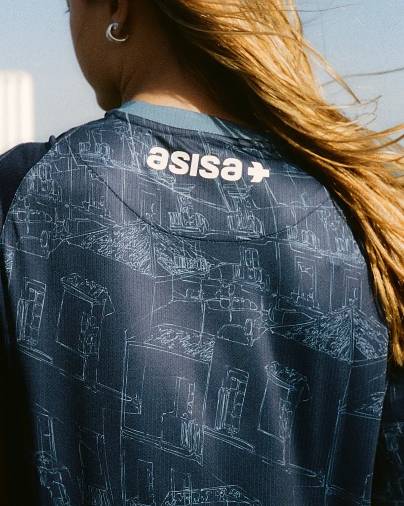
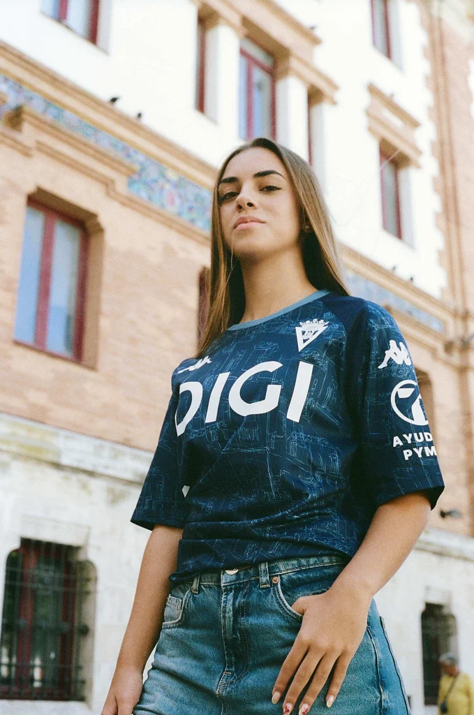
The evidence is in the change strips. The Away shirt uses a deep navy base covered by an intricate, light blue sketch graphic illustrating the city’s distinctive architectural streetscapes. It feels less like athletic gear and more like a bespoke piece of local storytelling.
The Cádiz Third kit moves entirely away from traditional club colours. It features a warm sand base integrated with a tonal pattern of undulating horizontal lines. Kappa states the design directly references the golden sands of local beaches and the winds that sweep across the Bay of Cádiz.
Both shirts prove the manufacturer was hired to push the club’s visual identity into a space where football shirts exist as cultural objects.
The Problem with a Quiet Football Shirt
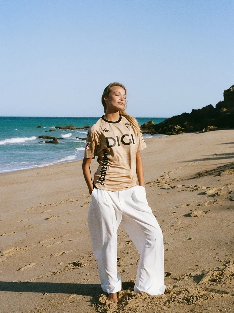
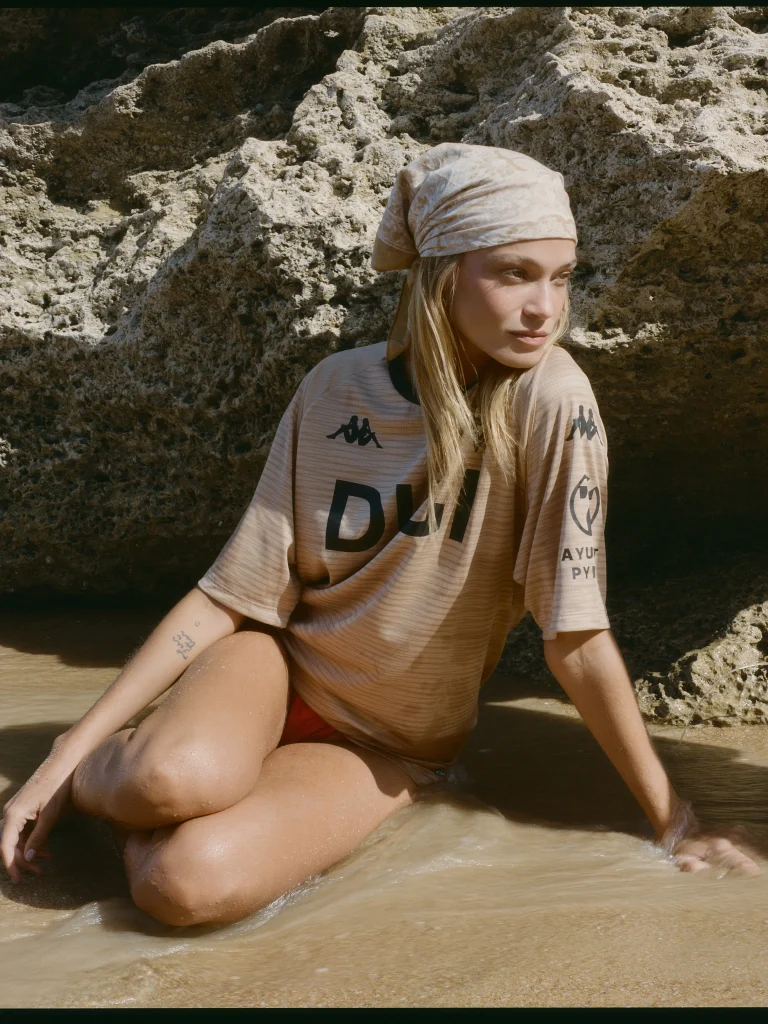
Kappa clearly applied that same ambition to the Cádiz Home kit, but chose a different method. Instead of complex architecture or tonal storytelling, they opted for empty space.
The problem with a stripped-back football kit is its fragility. A quiet shirt relies entirely on negative space to establish its aesthetic. If a heavily patterned shirt is interrupted by a sponsor, the busy fabric absorbs the impact. If a completely blank canvas is interrupted, there is nowhere for the eye to hide.
Kappa designed a shirt that requires breathing room. Modern football economics rarely leave room to breathe.
When the Shirt is Real Estate
The restraint Kappa built on the Home kit is immediately shattered by a massive “Turismo” sponsor logo stamped across the chest.
The logo does not just look loud; it completely ignores the physical geometry and tailoring of the shirt. It is not integrated or colour-matched to the royal blue accents. It simply dominates the torso, fighting the empty space the manufacturer tried so hard to establish. Supporter backlash followed the release, focused almost entirely on how the sponsor placement ruined a potentially classic design.
This is an economic reality.
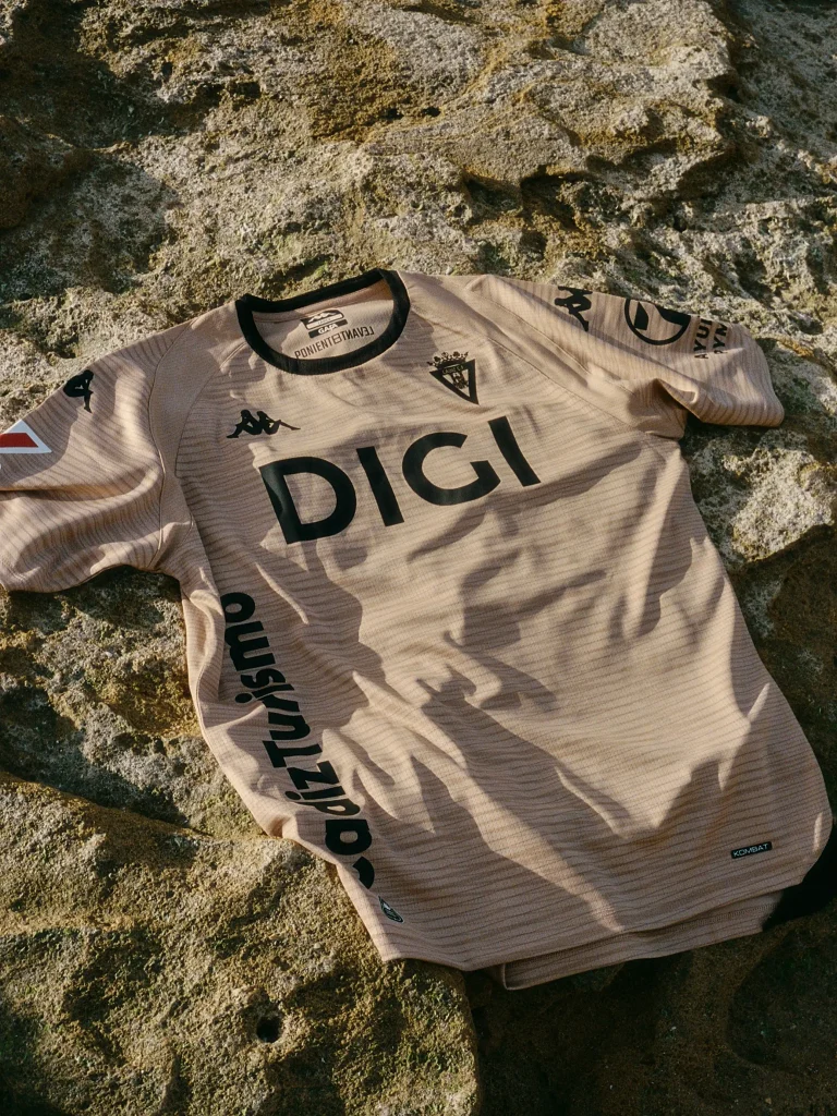
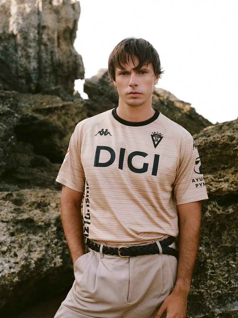
Kappa Cádiz CF operates in a financial ecosystem where commercial survival dictates terms. A club fighting for revenue cannot walk into a boardroom and demand that a primary sponsor shrink its logo or alter its corporate colours to preserve the integrity of a retro polo collar. The sponsor is paying for a billboard, and the club must provide one.
Kappa did exactly what they were hired to do. They gave Cádiz 2026/27 Kits a bespoke visual identity, delivering an architectural Away kit and a highly conceptual Third kit that successfully capture the geography of the city. They also designed a genuinely excellent Home shirt.
But that Home shirt serves as a harsh reminder of how the modern game actually operates. You can hire an Italian sportswear brand to design a beautifully clean classic, but a blank canvas is a luxury only the richest clubs can afford to protect.